Rough Sketches


'Jiki Poster Font
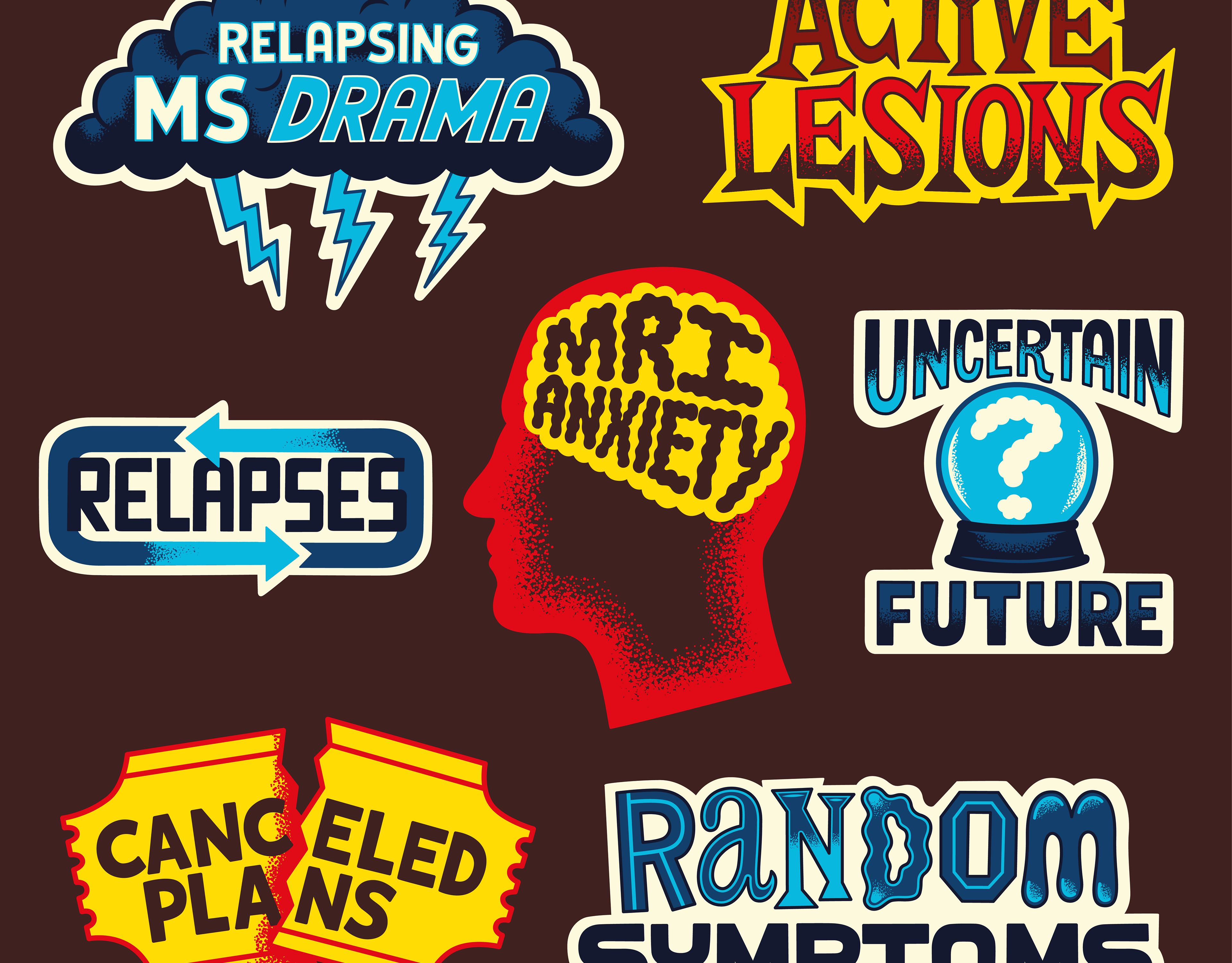
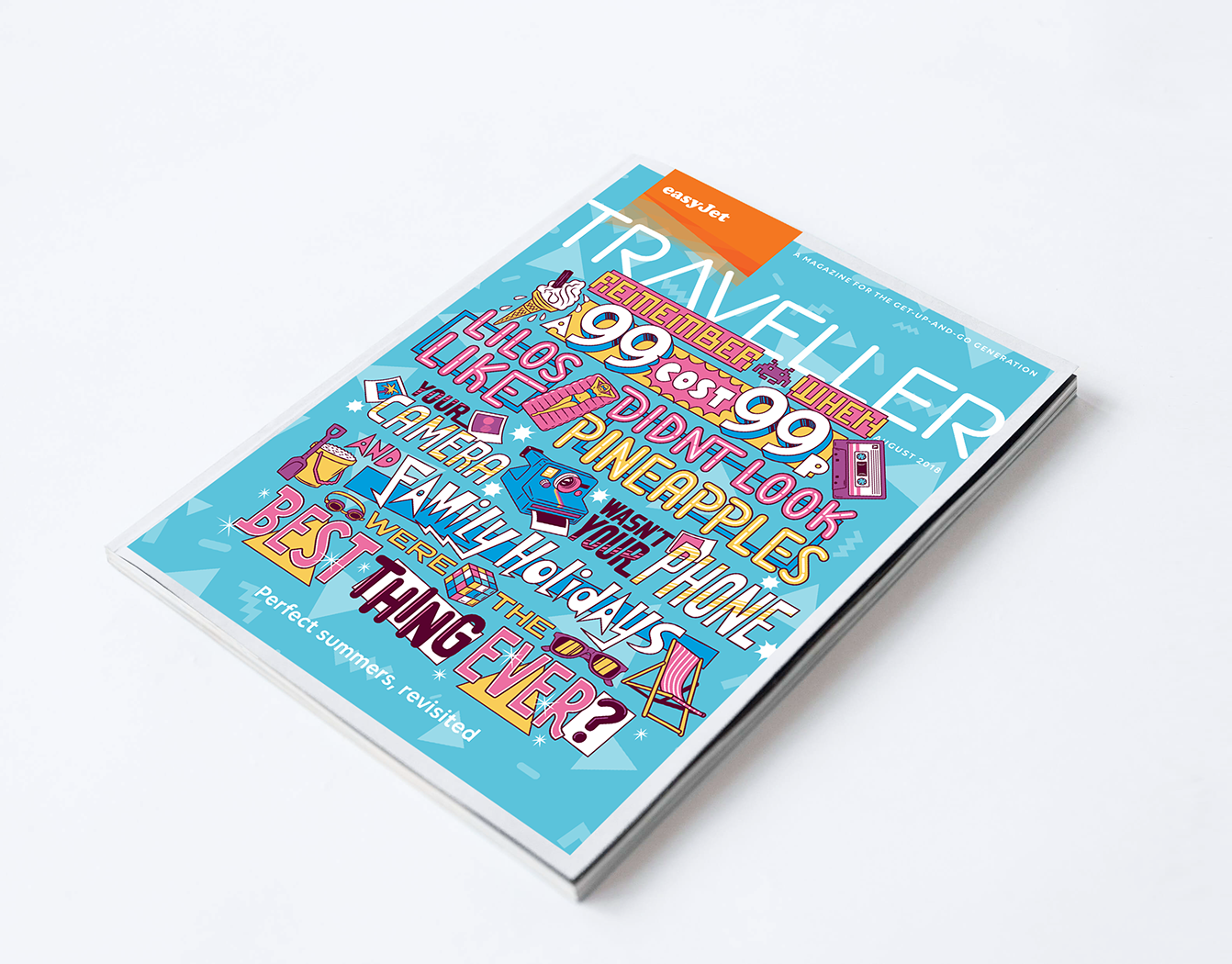
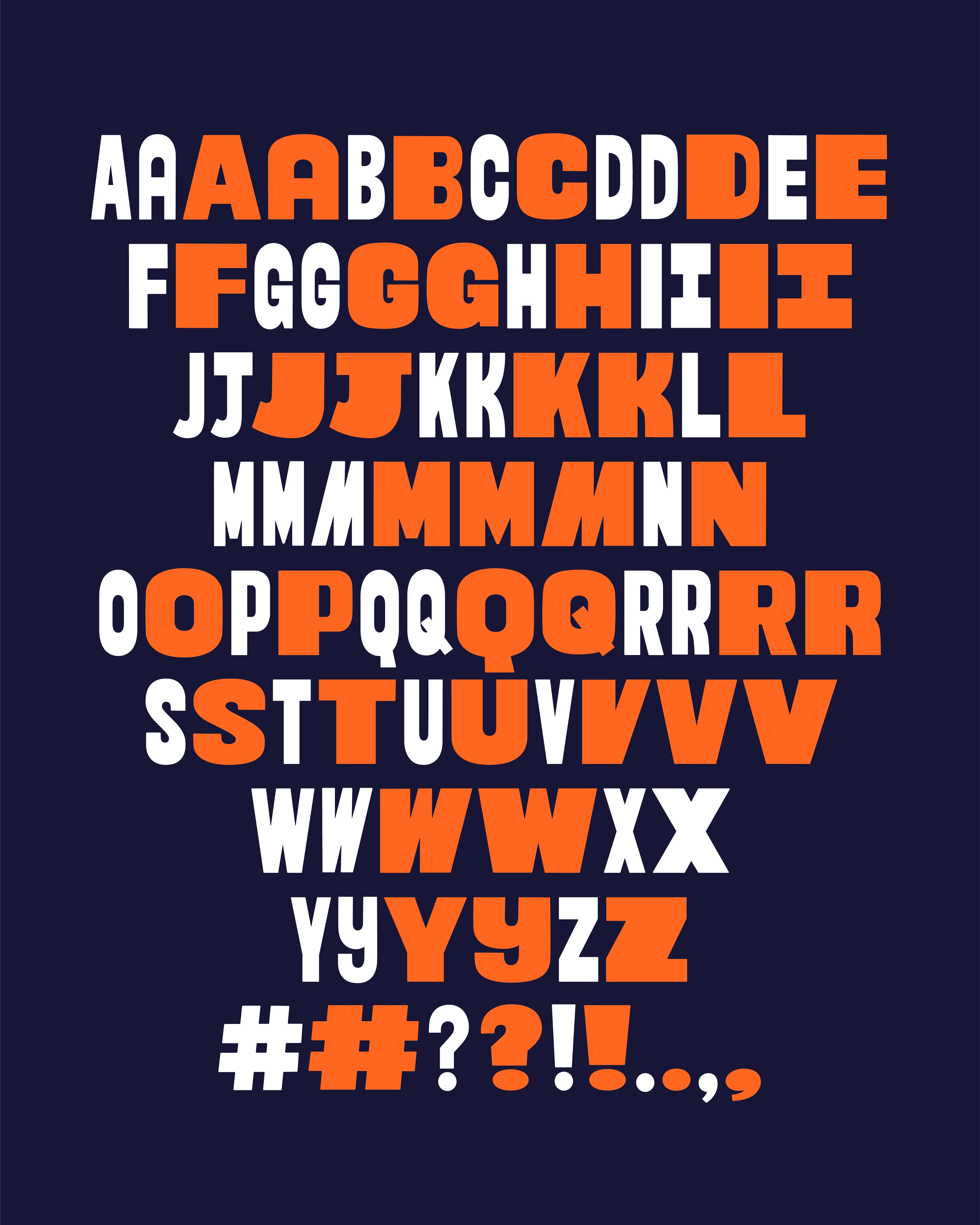
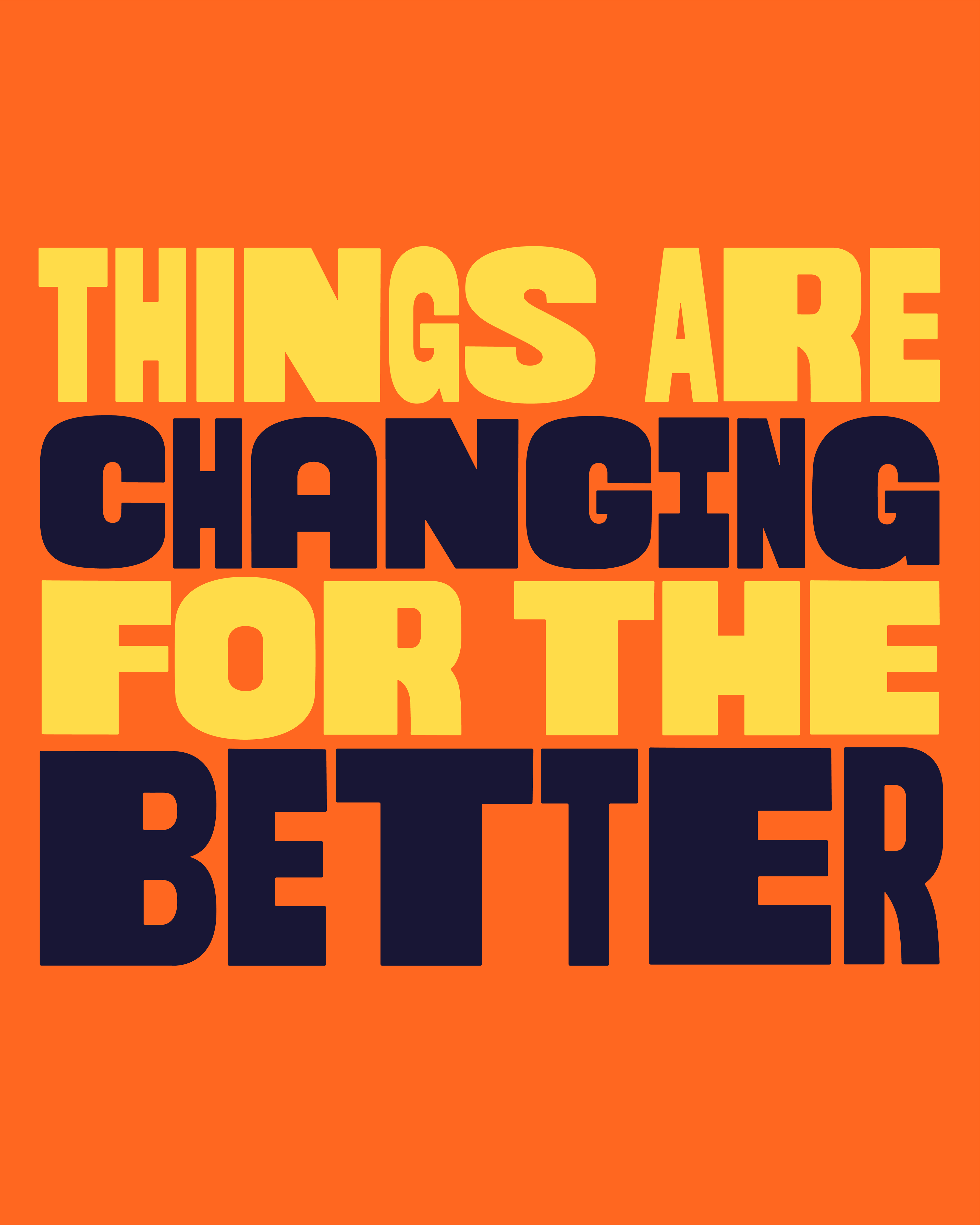
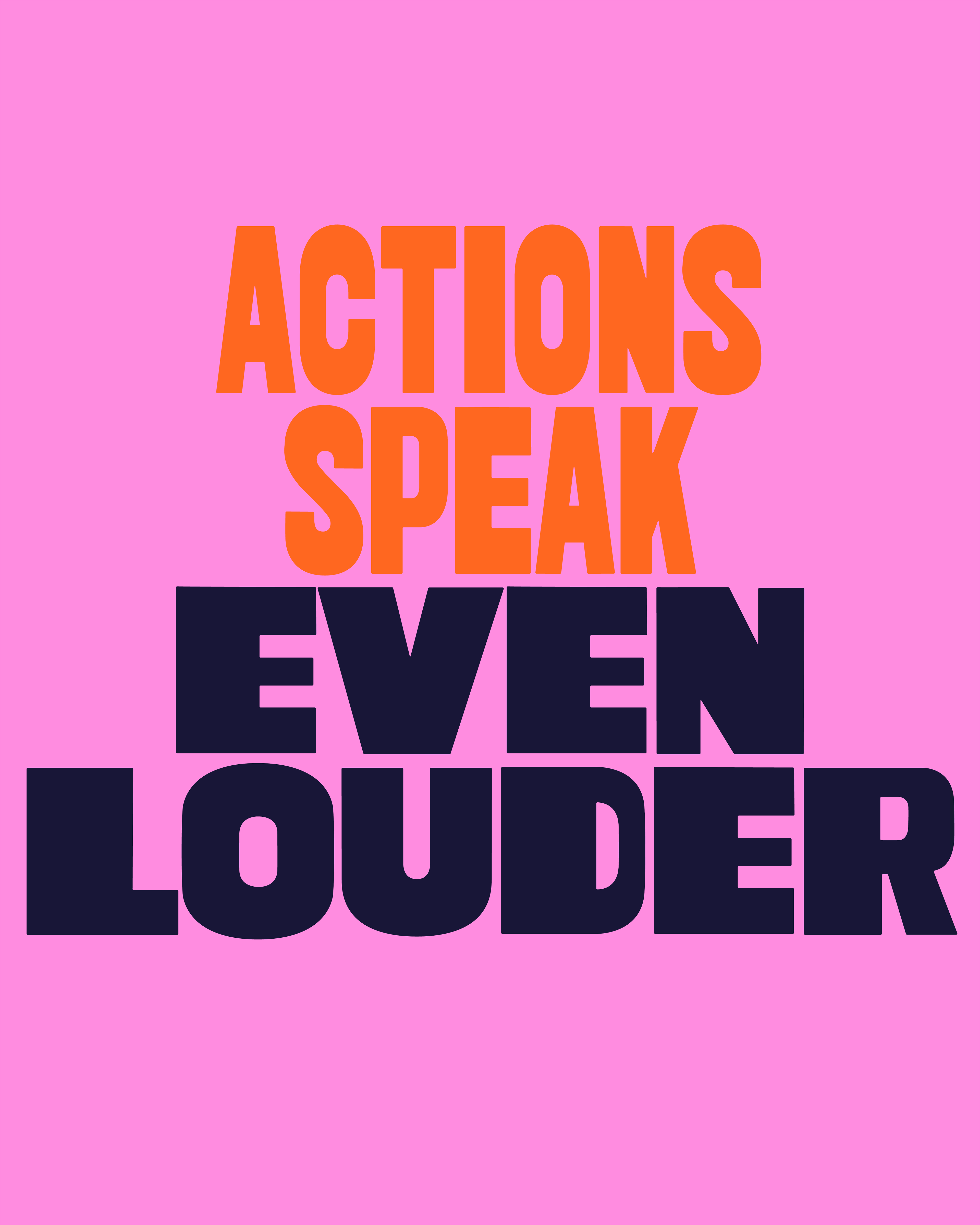
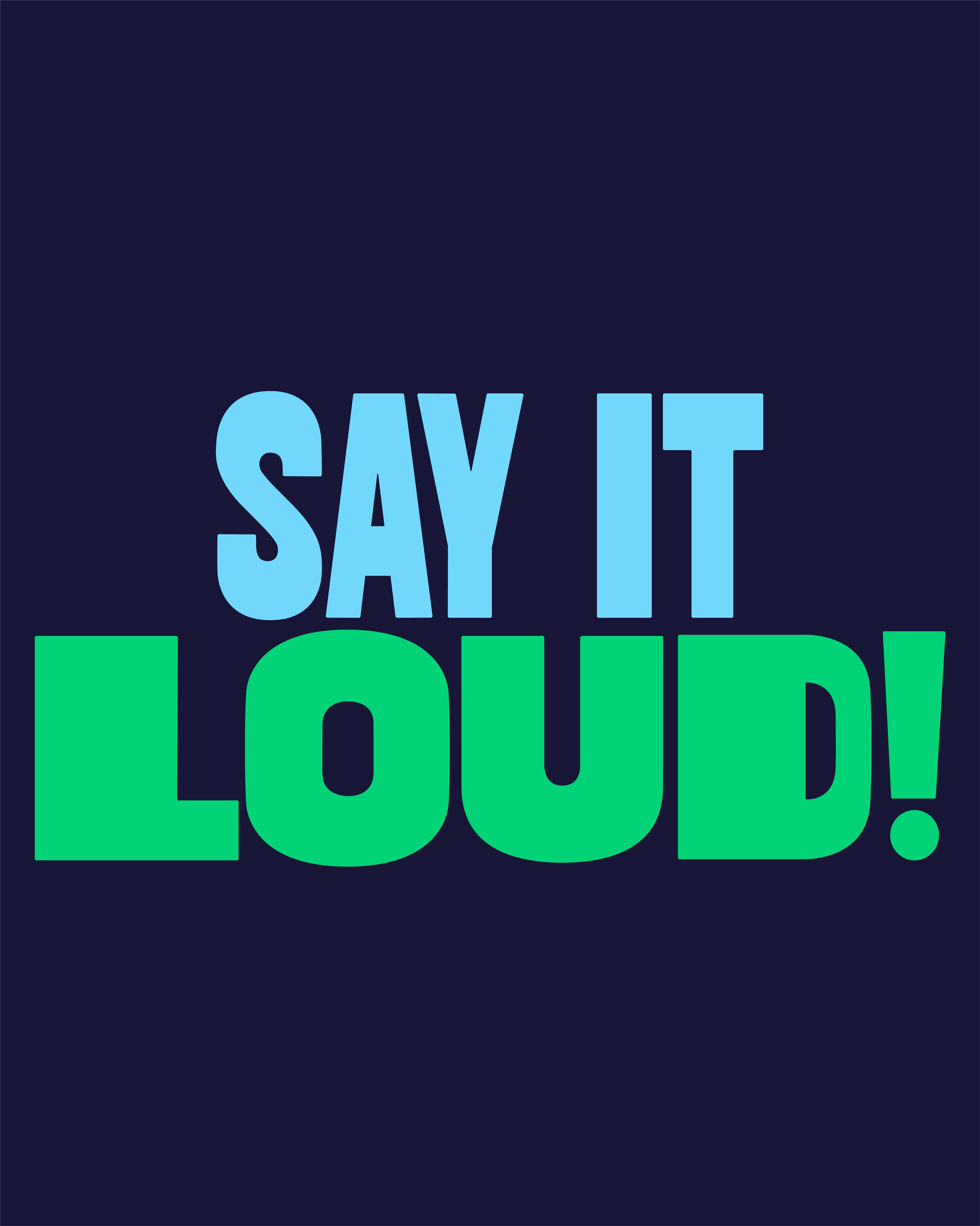
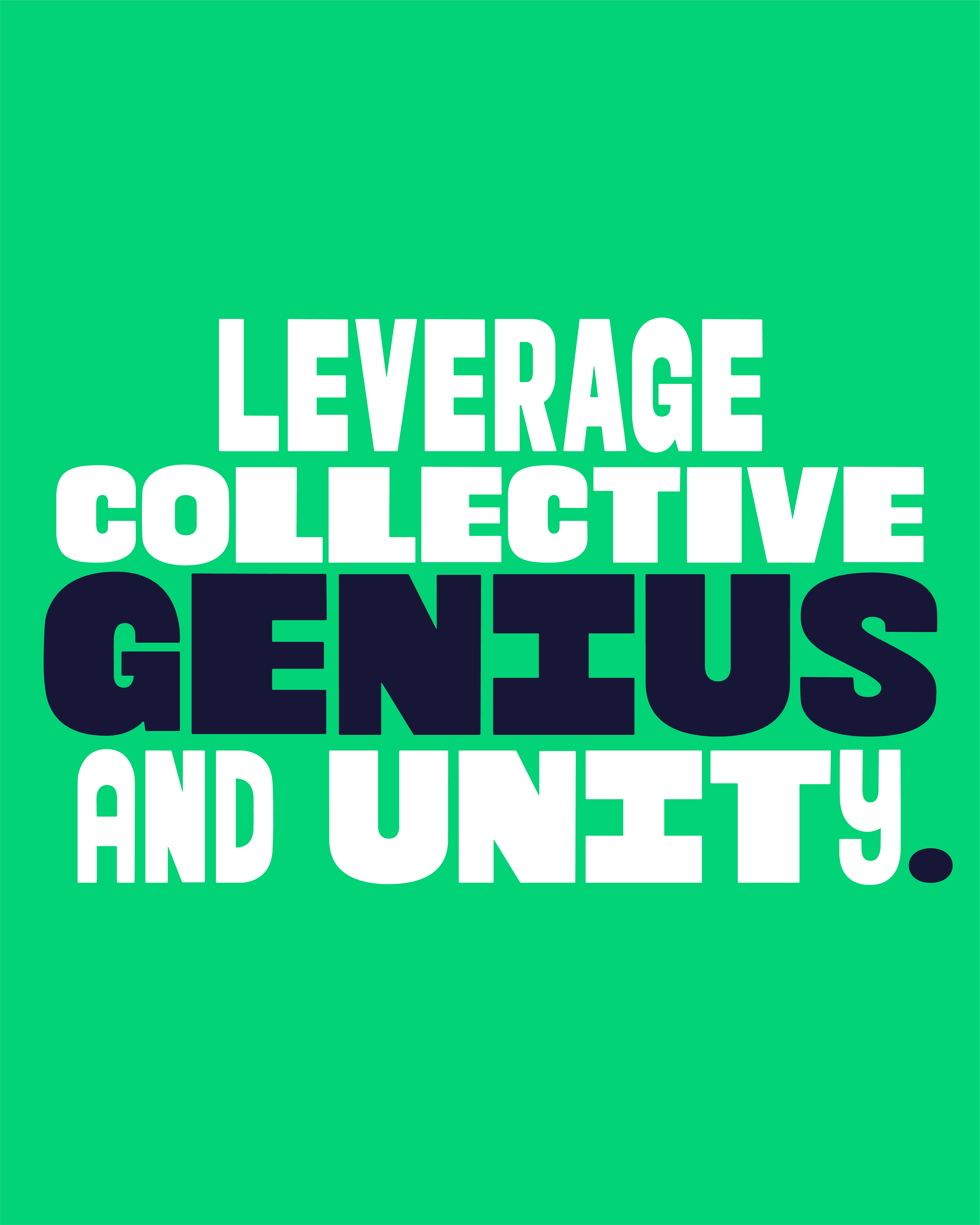
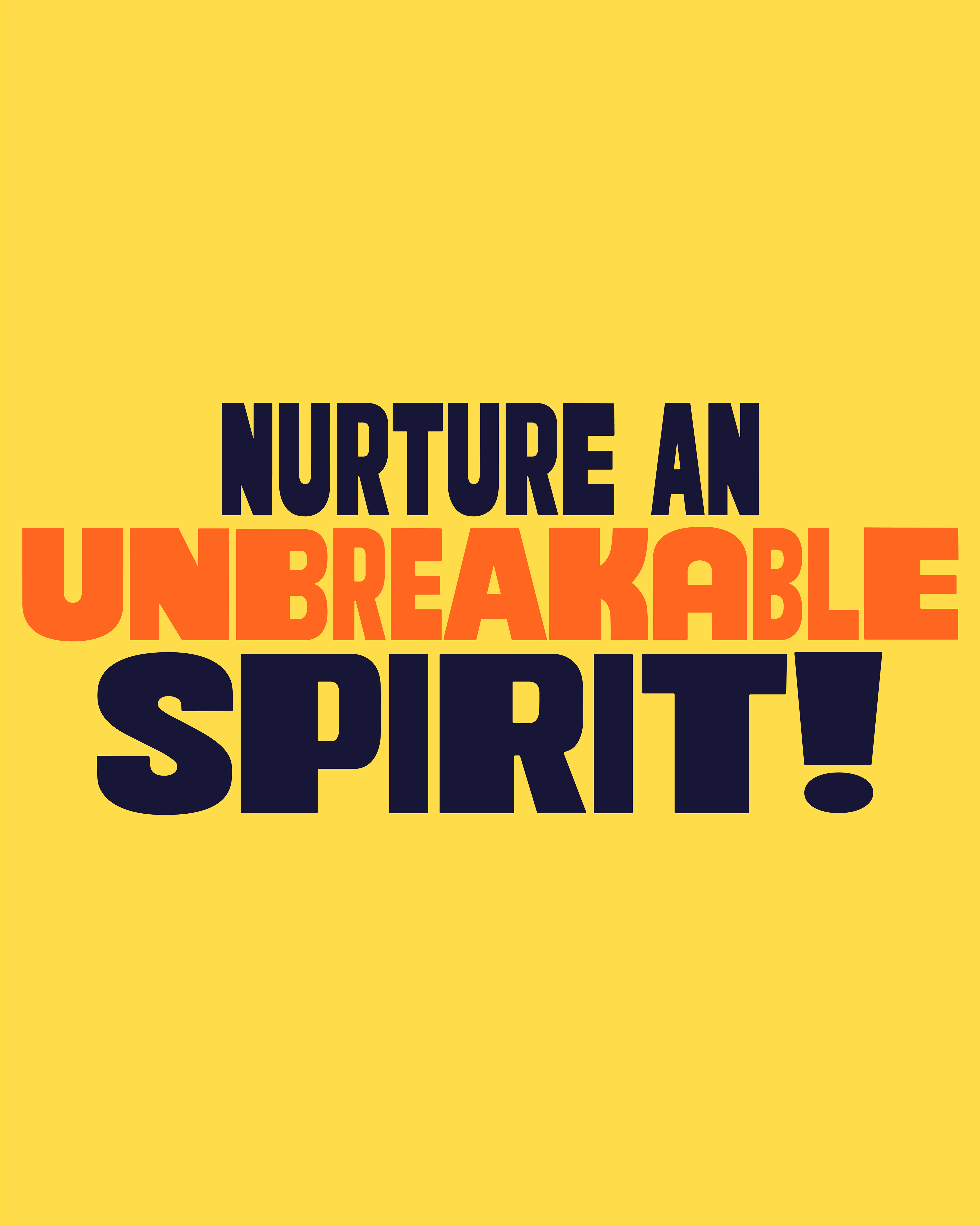
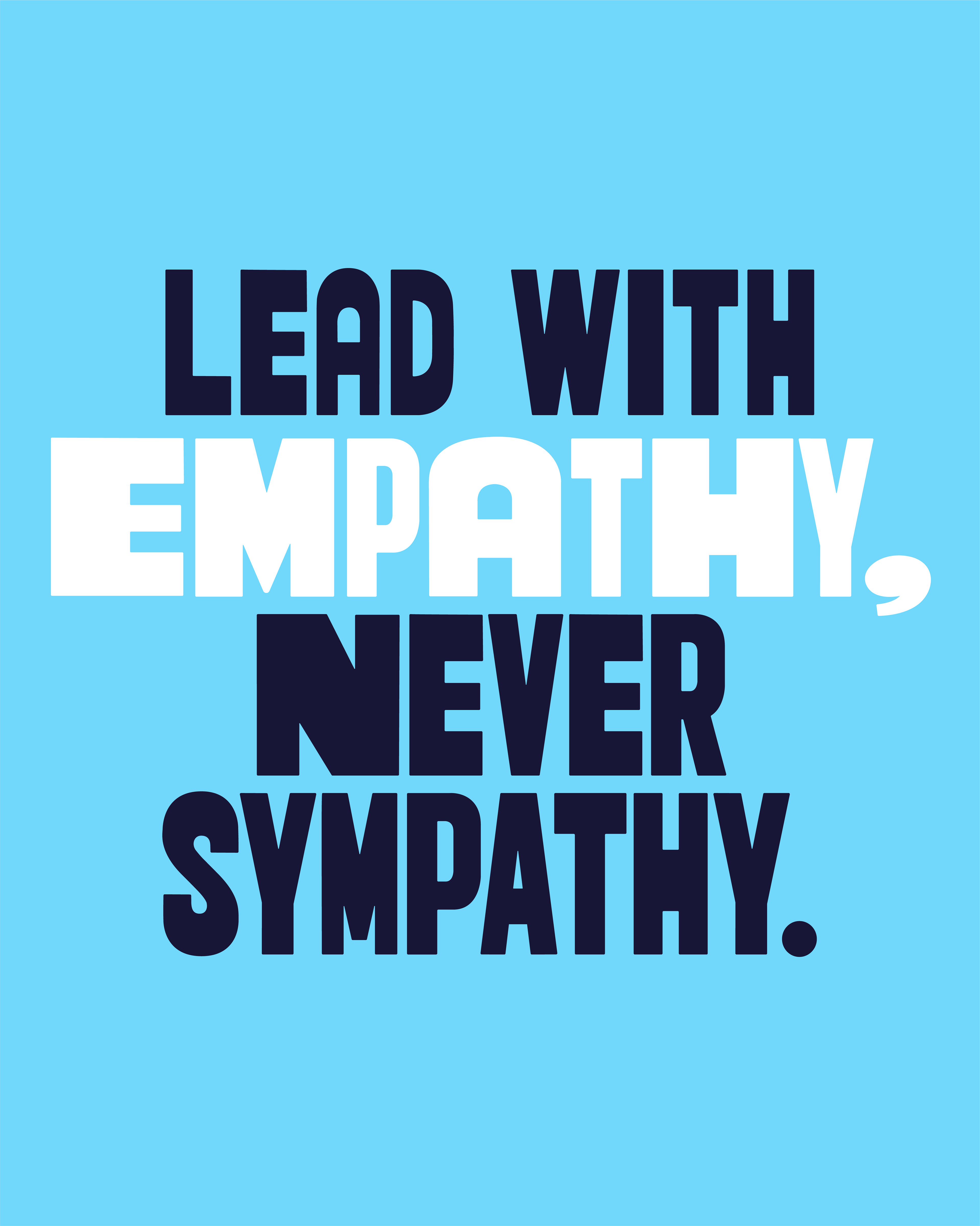
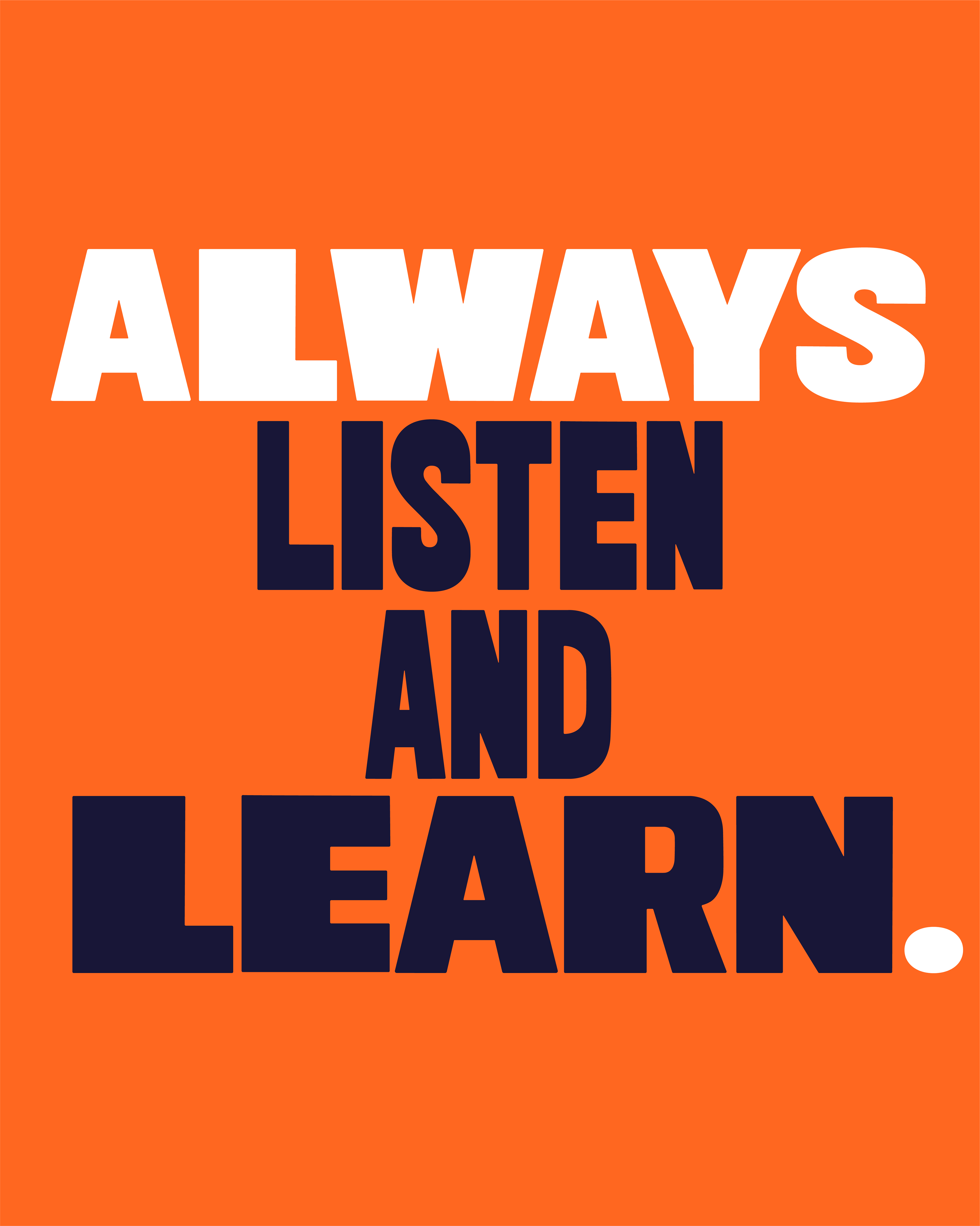
Each typeface was hand drawn to ensure the lettering retained a tactile feel to each character. ‘Jiki Poster’ was created in both a bold and narrow weight with alternate characters added in to allow for unique combinations and enhanced personality. The typefaces were designed to be interchanged mid sentence, to give a sense of disruption and character to the messaging and reflect the brands positive and bold nature.
Full Alphabet
Slogan Layouts

Animations by Martin Mezzabotta
'Jiki Script Font
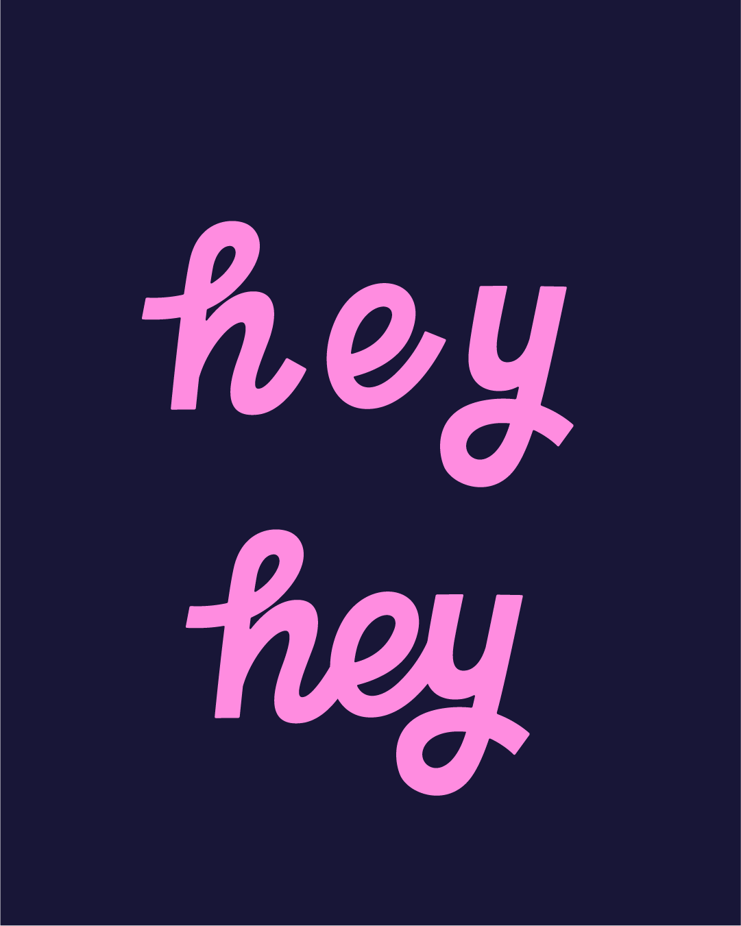
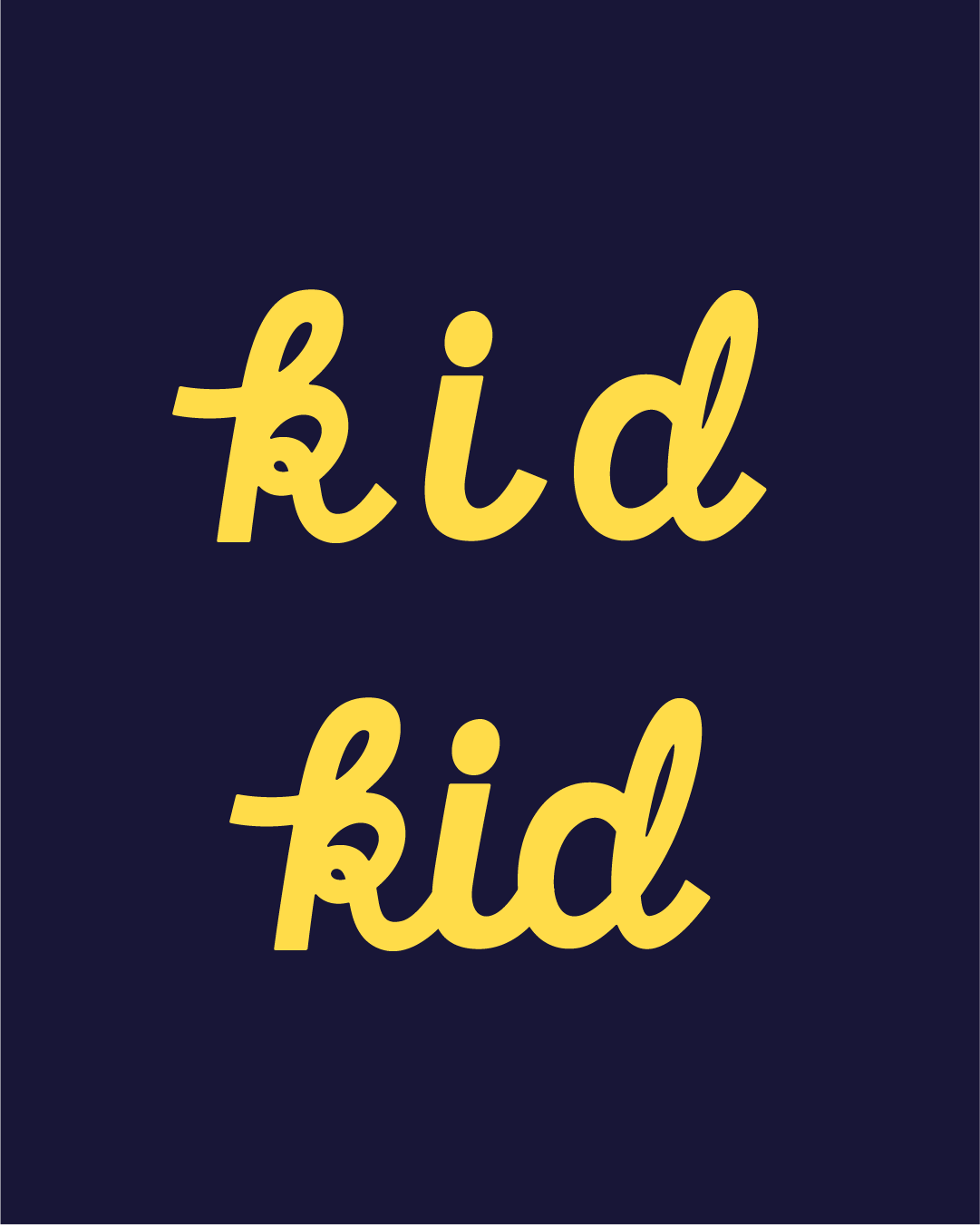
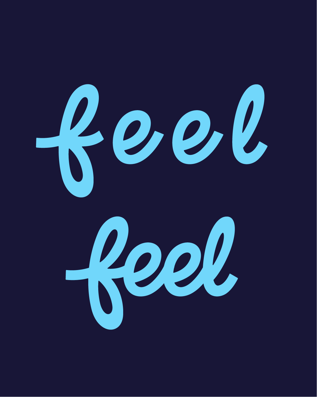
‘Jiki script’ was created to compliment and be used alongside ‘Jiki Poster’ to accentuate specific words or phrases and create an added element of flexibility across the messaging. I crafted each character to be easily joined or separated depending on the use in a way that retains the hand-drawn, energetic feel.

